Brand Evolution
SnapLogic – Evolving the visual identity and building a scalable brand system for a fast-growing enterprise integration platform.
Modernizing a SaaS Brand for Growth
As SnapLogic evolved, its visual identity needed to better reflect the company's growing product portfolio, market position, and ambitions. Working closely with the CMO and cross-functional stakeholders, I led the visual evolution of the brand—creating a scalable design system that strengthened consistency across marketing, sales, product, and corporate communications.
The refreshed identity balanced a more modern visual language with the flexibility needed to support a fast-growing technology company, ensuring the brand could scale across digital experiences, campaigns, events, and customer communications.
My Role
I led the creative direction and execution of the brand refresh, partnering with marketing leadership and external vendors to bring the new identity to life across every major customer touchpoint.
Responsibilities
Brand strategy and visual direction
Creative direction and design execution
Cross-functional collaboration
Project management
Production oversight
Internal and external rollout
Scope of Work
The refreshed visual identity was implemented across a wide range of brand experiences, creating a cohesive system that teams could apply consistently.
Deliverables included
Brand identity system
Marketing collateral
Website refresh
Presentation system
Business stationery
Product iconography
Technical diagrams
Sales enablement materials
Internal communications
Event graphics
Environmental branding
Swag and promotional materials
The Outcome
The refreshed identity established a more cohesive and contemporary visual language that better reflected SnapLogic's evolving platform and positioned the company for continued growth. By creating a flexible design system rather than a collection of individual assets, the brand could be applied consistently across teams, channels, and future initiatives.
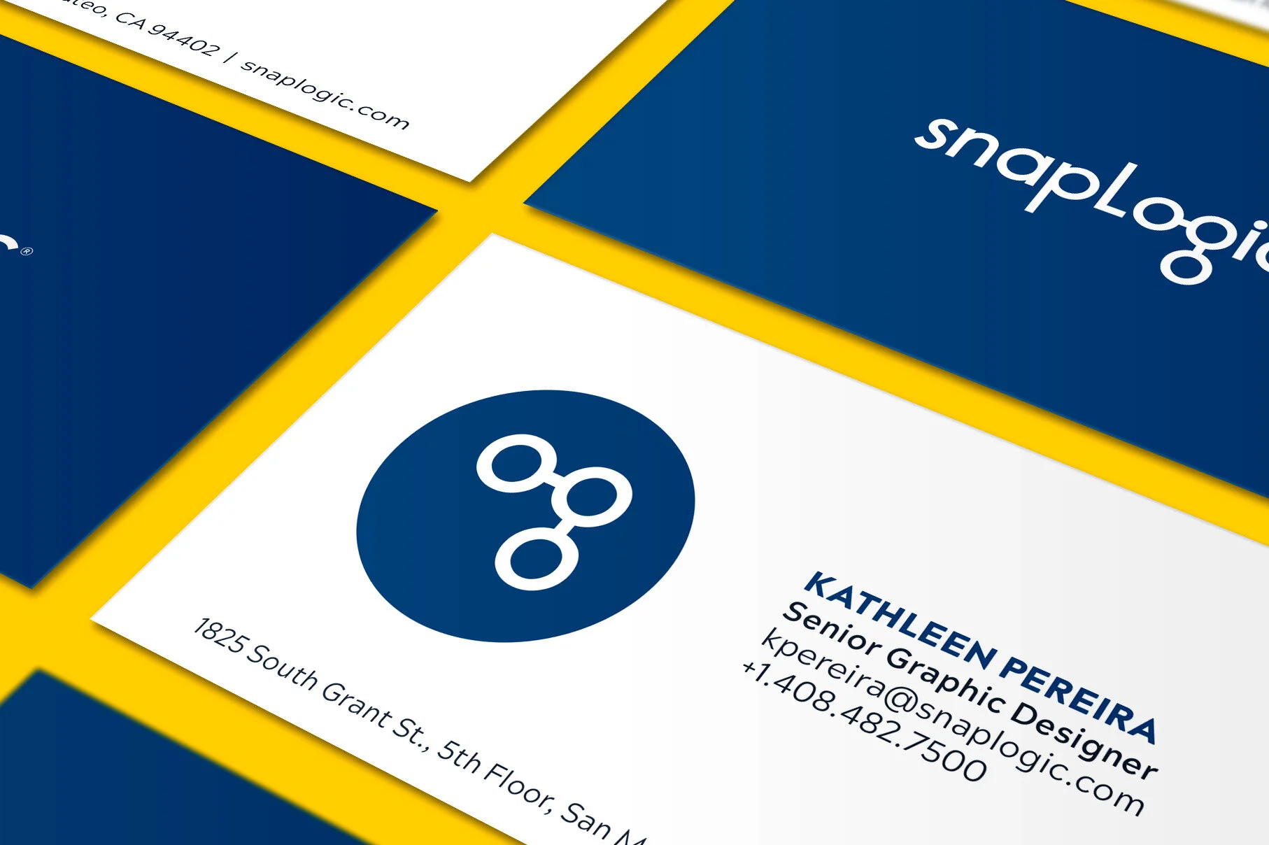
Designed the glyph (OG) to be used as an element across collateral
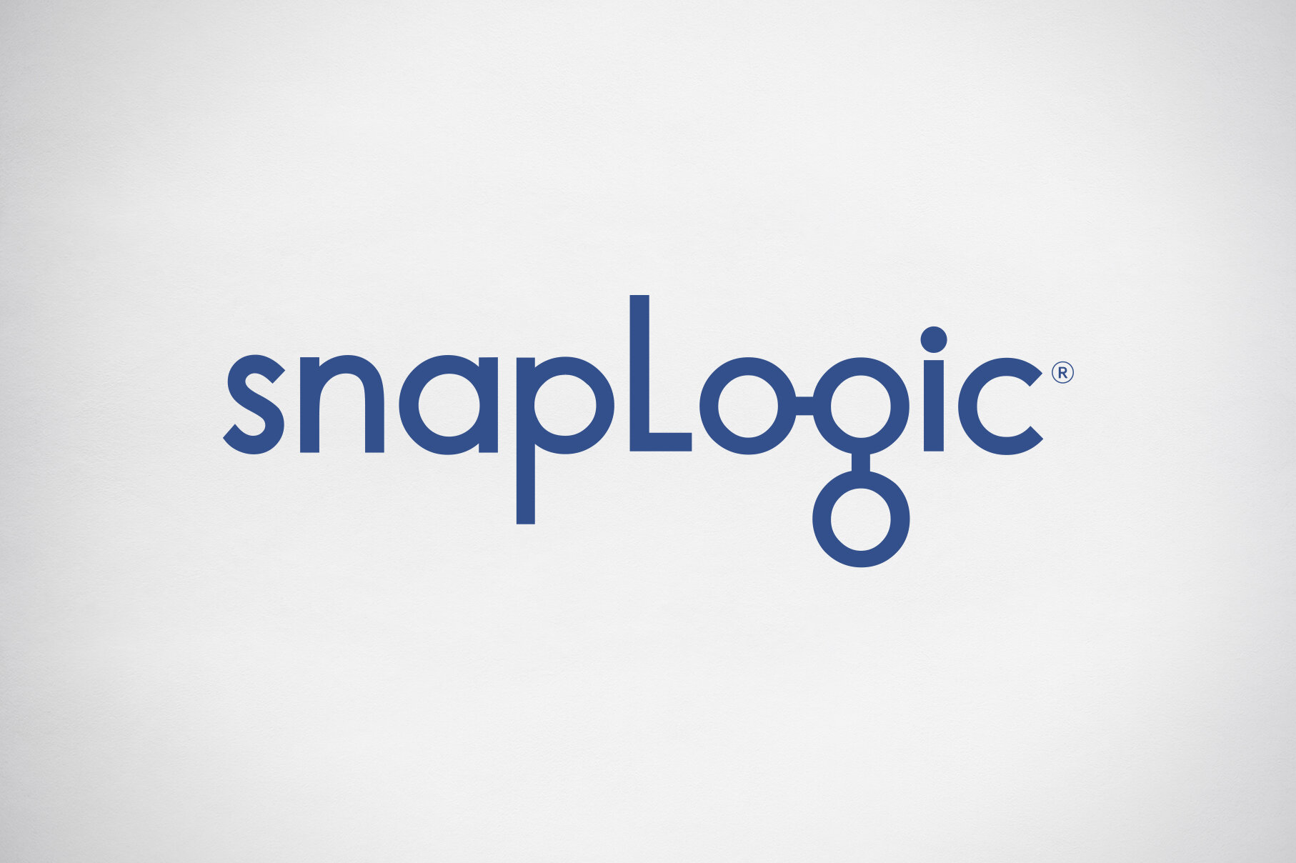
Updated the logo into the solid classic blue
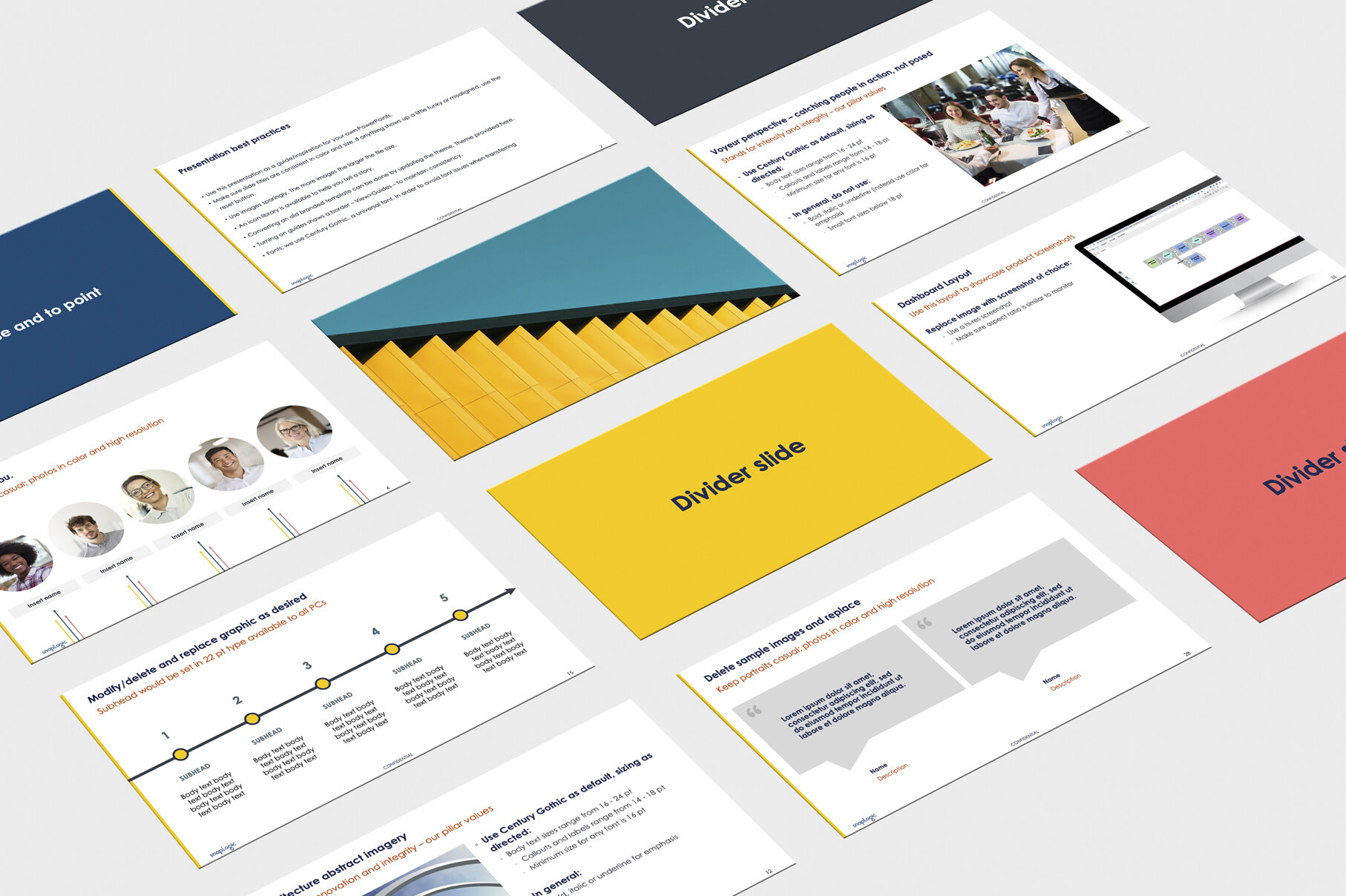
Created a diverse PowerPoint template
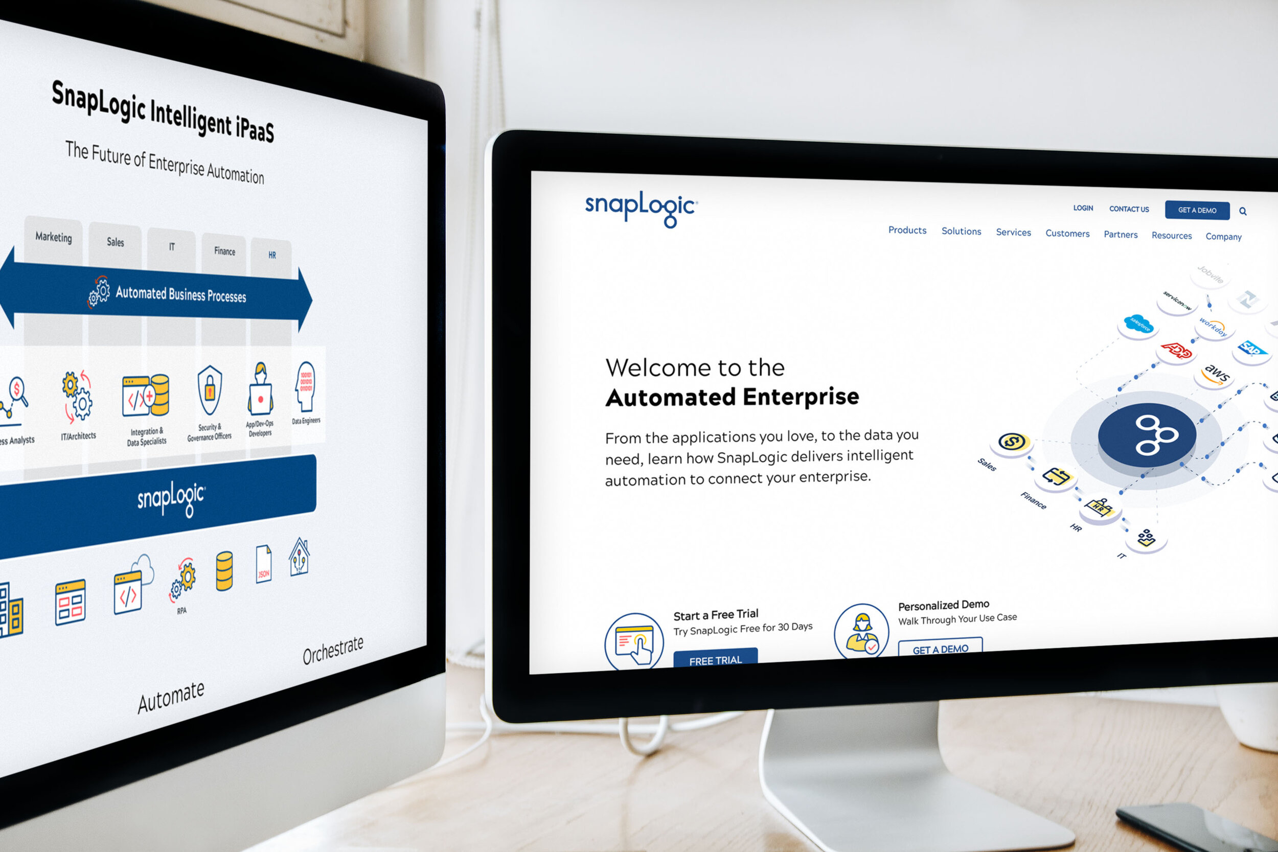
Brand refresh extended to the website and all supporting assets
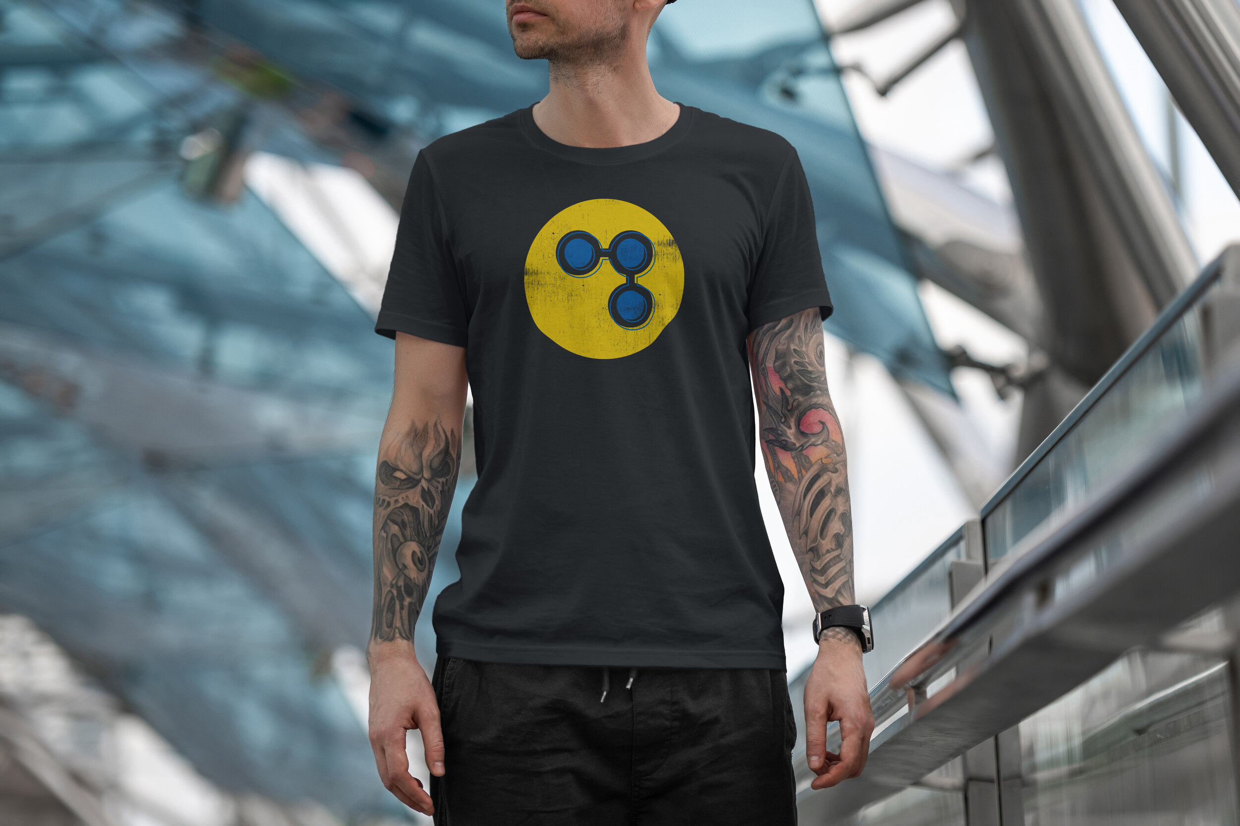
Created some "fun" t-shirt designs to create brand awareness
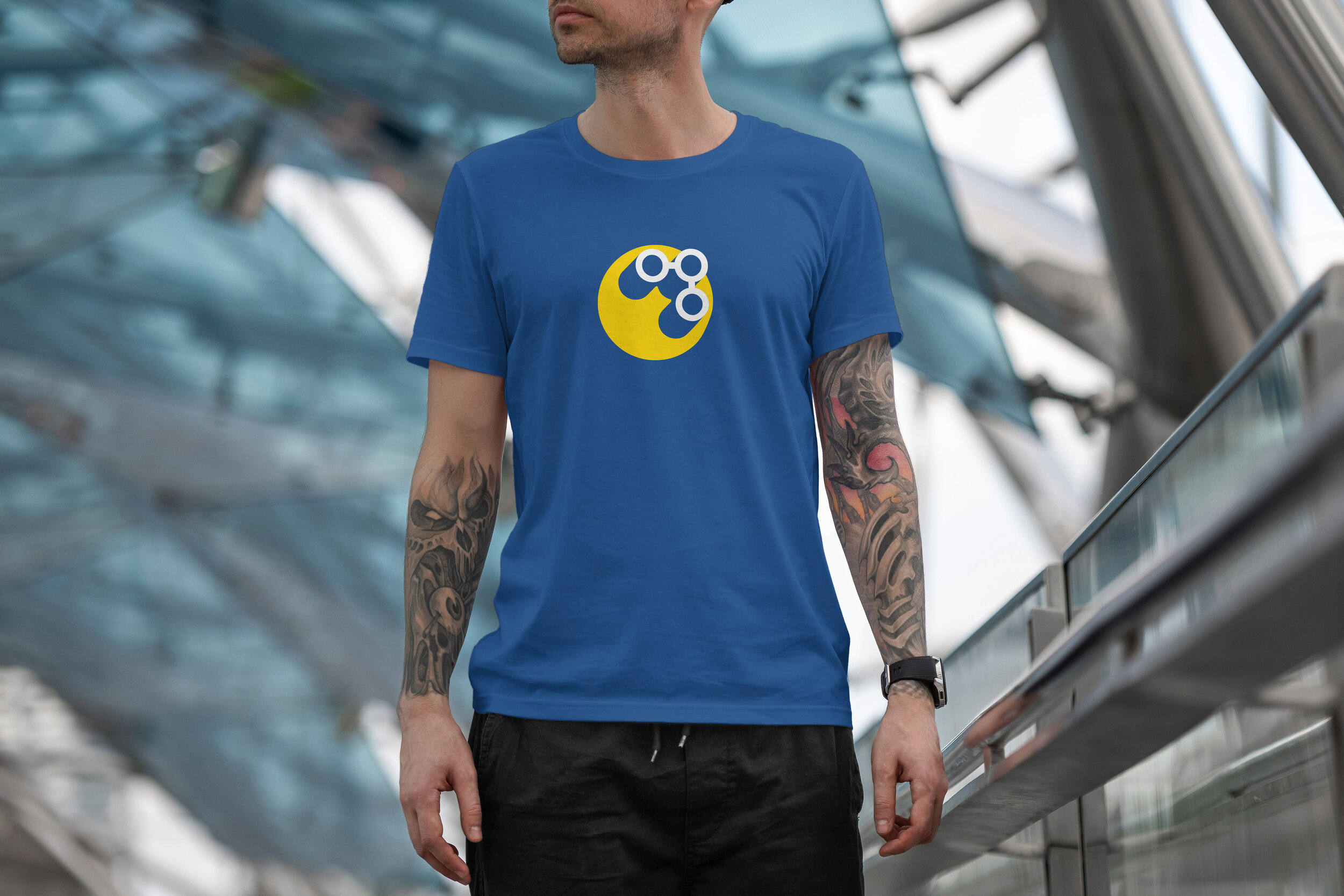
The OG signal t-shirt design on the classic blue
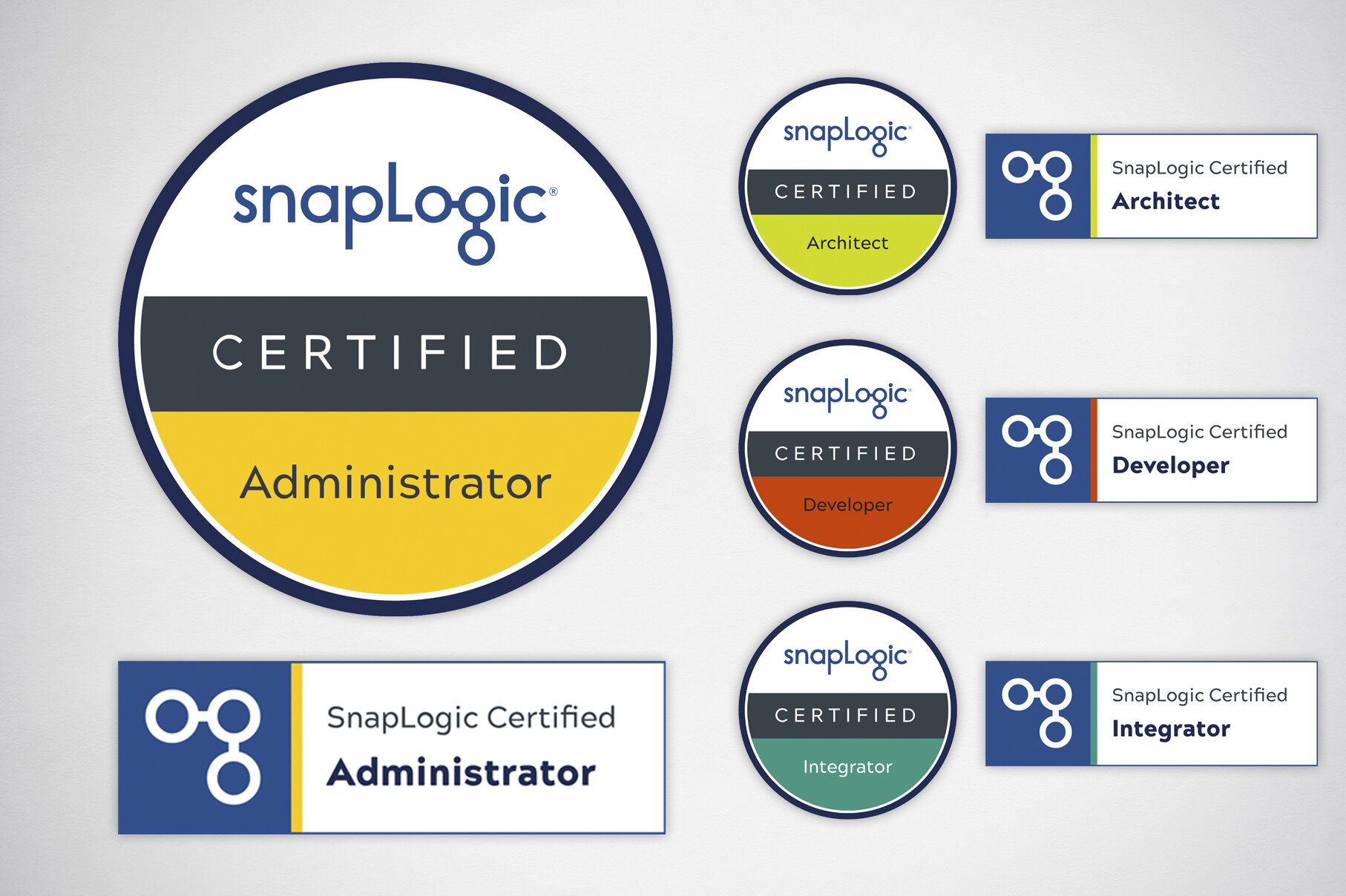
New color palette lends itself well to color code and make assets pop
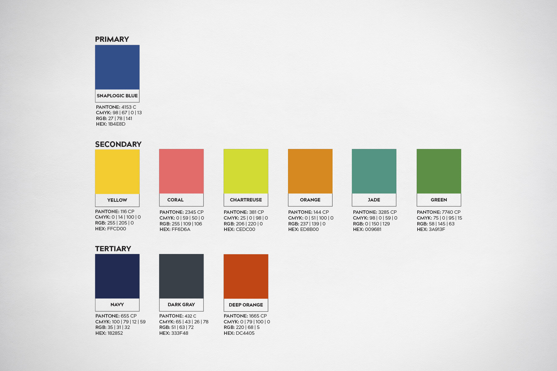
Color palette
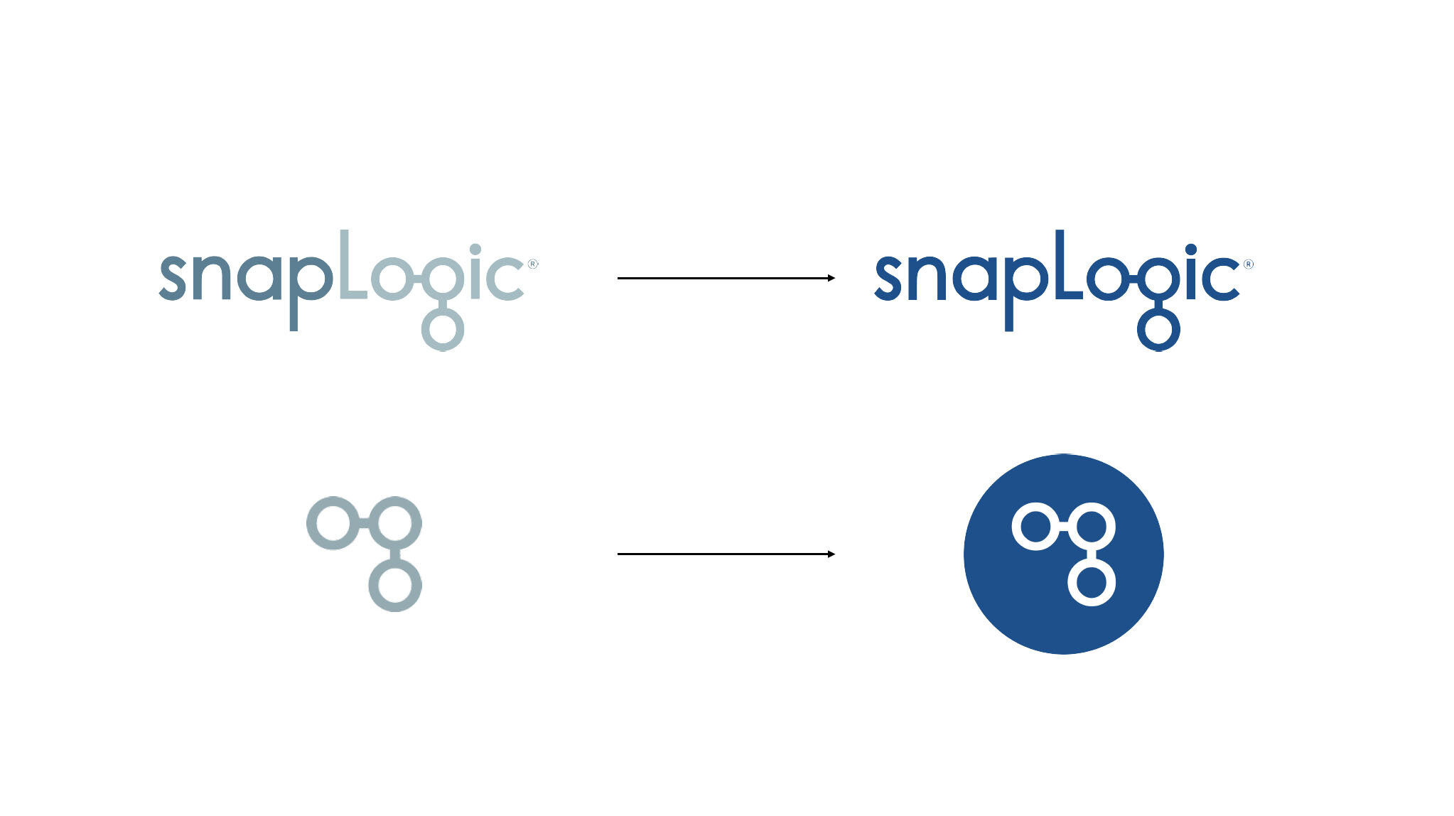
Before and after
More brand work.
Below is a collection of other brand work done through the years.